Counting the Trucks
- Money flow tracks unusual volume and whether a stock closed strong or weak. It’s sold as a way to spot “smart money”
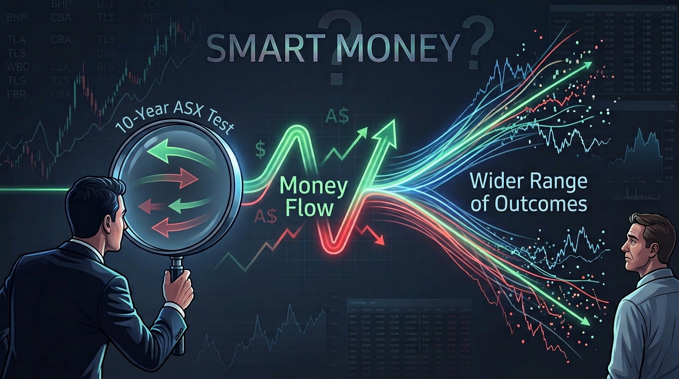
- We tested it across ten years of ASX data. It does not predict direction; the one significant result pointed backwards
- What it does flag is that the range of outcomes just got wider. Which is useful, just not the way it’s marketed
You’d been watching it for months. A mid-cap you actually understood, in a sector you’d done the reading on. You were waiting for a reason.
Then you open the app on a Tuesday and it’s up 14% over three weeks.
No news. Nothing you missed. It just went.
And the worst part isn’t the money. It’s the question that follows you around all day: was there something there to see?
An entire industry exists to sell you the answer to that feeling. Usually it’s called “smart money” or “institutional accumulation”: the comforting idea that someone knew, that footprints got left behind, and that for a monthly fee you can learn to read them.
This is about those footprints. What they are, what they tell you, and, because we actually measured it, what they flatly don’t.
The simple explanation
Picture a quiet road into a country town. Most days about forty cars go past. Nobody counts them. You just know what normal looks like.
Then one Tuesday, two hundred trucks come through.
You don’t know what’s in them. You don’t know who sent them or why. Nobody’s told you anything.
But you’d be a fool not to notice.
That’s money flow. It counts the trucks.
What it does NOT tell you is whether the town’s about to boom or about to flood. That’s the part everyone skips, and it’s the part that matters. Two hundred trucks could be a new factory going up. It could equally be everyone moving out.
The traffic tells you something is happening here. It doesn’t tell you what.
There’s a second layer, mind you, and it’s what makes this more than a curiosity. You can also notice whether the trucks arrive loaded and leave empty, or the other way round. In markets that’s roughly the difference between a stock closing near its high for the day versus near its low, on the same heavy volume.
Same traffic. Different direction of travel.
So money flow is two questions asked at once: is today’s trading unusually heavy for this stock, and did it close strong or weak?
The rest is arithmetic.
What’s actually being measured
Three numbers do the work. None needs anything fancier than ordinary end-of-day prices.
| Measure | Plain English | Typical range |
|---|---|---|
| Relative volume | Today’s volume ÷ its own 20-day average. “2.1×” means twice the usual traffic | 0.2 – 10+ |
| Chaikin Money Flow (20-day) | Where the stock keeps closing inside its daily range, weighted by volume | −1 to +1, sits near 0 |
| Average daily turnover | 20-day average of dollars traded, not shares | A$0 – A$500m+ |
First one’s the truck count. Second is whether they’re loaded. Third is the one nobody talks about and everybody should. We’ll come back to it, because on the ASX it’s the one that can actually hurt you.
The name is a lie
Quick detour, because this one genuinely trips people up.
“Money Flow” sounds like it tracks money going into and out of a stock.
It doesn’t. Nothing does.
For every buyer there’s a seller. The same dollar leaves one pocket and lands in another. No money enters or exits; it changes hands.
What Chaikin Money Flow actually measures is where the price settled inside its own daily range, on the theory that closing near the high repeatedly suggests buyers were the impatient side of the trade.
That’s an inference about behaviour. Not an observation of cash. Worth hanging onto when someone shows you a chart of “money flowing in”.
Right, the arithmetic
Take one day. The stock ranges between $9.80 and $10.40 and closes at $10.35 on 3 million shares.
Step one is working out where in that range it closed, on a scale from −1 to +1. It ranged 60 cents. It closed 55 cents off the low and 5 cents off the high. Net that out against the range and you get +0.833: a strong finish.
Multiply by the 3 million shares and you book 2.5 million as accumulation for the day.
Now change one thing. Same range, same volume, but it closes at $9.85 instead. The number flips to −0.833 and you book 2.5 million as distribution.
Identical turnover. Opposite reading. The close is doing all the work.
Chaikin Money Flow then adds that up over 20 sessions and divides by total volume, which is what makes it comparable between a bank and a lithium explorer. You get a number between −1 and +1.
In practice it lives near zero. Across the liquid ASX universe the median sits around −0.05, and anything past ±0.10 is already unusual.
Three things that catch people out
Today is inside the average. A genuine 10× volume day computes as about 8.6×, because today’s monster volume is also sitting in the 20-day average it’s being measured against. Not a bug. But don’t quote it as “ten times the prior average”, because it isn’t.
Gaps are invisible. The calculation only looks inside the day’s own range. A stock that gaps up 9% at the open and then drifts sideways all session scores near zero. All that movement, no signal.
Zero-range days break it. When the high equals the low (common in thin stocks) you’re dividing by zero. Convention is to score that day zero, which is correct, but it means the quietest stocks generate the least signal exactly when you’re most curious about them.
So we tested it
This is where most articles on the subject stop, having strongly implied that unusual volume plus a strong close means you should be buying.
We wanted to know whether that’s true on the ASX. So we measured it.
Ten years of daily history. For every day a signal fired, we recorded what the stock did over the following 1, 4 and 13 weeks, measured as the excess over what every other liquid ASX stock did that same day.
That last bit is what makes it honest. Unusual-volume days cluster. A market-wide selloff puts hundreds of stocks above twice their average volume at once. Compare those against a flat benchmark and a “sell” signal looks predictive purely because sells bunch up ahead of weak markets. Subtracting the same-day market average kills that stone dead.
We tested four separate rules, not one. The standard unusual-volume rule, two different readings of CMF, and a “persistence” rule requiring repeated same-direction activity over weeks.
None of them predicted direction.
At every horizon, for every variant, the gap between the buy signal and the sell signal sat inside its own margin of error.
The one result that did clear statistical significance pointed the WRONG WAY. The buy leg under-performed the sell leg.
We also ran a control – a well-documented effect that genuinely exists in equity markets, put through identical machinery. It didn’t show up either. Which told us to be suspicious of the whole framework’s averages rather than to go trusting the one result that happened to flatter us.
But something did show up
Flagged stocks went on to move substantially more than unflagged ones.
Not up. Not down. More.
| Spread of 13-week outcomes | |
|---|---|
| Unflagged stocks | ~34% |
| Flagged by the standard rule | ~53% |
| Flagged by the persistence rule | ~69% |
That’s a large effect and a consistent one, and it’s the honest answer to “what does money flow tell you?”
It tells you the range of outcomes just got wider. It does not tell you which end you’re heading for.

Three ways to actually use it
As an attention filter. The ASX has roughly 2,400 listed entities and you cannot follow them. What money flow does well is answer “where did the pattern break today?”, which is a shortlist question, not a decision question. Use it to work out what to read about tonight. Then do the work that actually tells you direction: the announcement, the numbers, the sector. The signal gets you to the right page. It doesn’t read the page for you.
As a position-sizing input. This falls straight out of the dispersion finding and almost nobody does it. If a flagged stock has historically produced a 53% spread of outcomes against 34% for an unflagged one, the same dollar position in the flagged one carries materially more risk. Same conviction, same thesis, wider distribution of where you land. Worth knowing before you decide how much to put in, not after.
As a liquidity check: and this is the big one.
The number that should change how you think about the ASX
Of roughly 2,400 ASX-listed entities, only about 524 trade more than A$1 million a day.
Around 1,900 do not.
For those, average daily turnover isn’t an indicator. It’s a warning.
If a stock turns over A$60,000 a day and you’re holding A$40,000 of it, you are not a participant in that market.
You ARE the market, on the day you try to leave.
This is where the ASX genuinely parts ways with the US large-cap world most indicator writing assumes. A tactic that works fine on a stock trading 50 million shares a day can be actively dangerous on one trading 50,000. Not because the signal is worse, but because the exit isn’t there.
So before any flow reading means anything at all: check the turnover. If it’s thin, these metrics don’t really apply, and what matters is the exit rather than the idea.
And one way not to use it
Don’t read “unusual buying” as a reason to buy.
We looked. Hard, across ten years. It isn’t one.
Anyone telling you otherwise is selling you the comfortable version.
What it can’t do
Worth being blunt, because the gap between what these numbers are and what they get sold as is where people lose money.
It can’t see who’s trading. There’s no institutional-versus-retail split hiding in end-of-day price and volume. Any product claiming to show you “institutional accumulation” from this data is inferring, not observing.
It can’t tell you why. Index rebalancing, a fund’s quarter-end tidy-up, a block crossing, tax-loss selling in June all leave the same footprint as genuine conviction.
It can’t separate announcement days after the fact. Which means historical testing can’t cleanly distinguish “unusual volume” from “unusual volume because something got announced”.
It can’t predict direction. We measured. It doesn’t.
So why publish any of this? Because “the range of outcomes just widened” is genuinely useful, and because knowing what a tool doesn’t do is what stops you betting the house on it.
The investors who get hurt by indicators are rarely the ones who understood the limits.
They’re the ones who got sold certainty.
Signal Savvy Investor covers the ASX. We’re opening spots in our Early Access Programme: free access for eight weeks, in exchange for telling us what’s wrong with it.
This article is general information only. It is not personal financial advice and does not account for your objectives, situation or needs. Past patterns are not predictions. Consider obtaining advice from a licensed financial adviser before making investment decisions.
